How does a book come into the world?
For me a book is an independent unit of meaning. A packaged microcosm, like the miniature works of Marcel Duchamp packed in a suitcase in La Boîte en Valise, or like a NASA capsule launched into space. A broadcast sent over the airwaves, it has almost an autonomous internal existence and contexts. A book can exist anywhere, it does not need a gallery, a library, or explanations. It does not take up much space and there is a good chance that it will outlive me. I like the format of a book also because works of art are usually very expensive, and in an artist’s book they become accessible enabling a prolonged and in-depth encounter with works that we would normally look at for a few seconds at most. The desire to create a book arose in me as soon as I felt that I had enough works and material that would allow me to tell a story, it took me a long time to get to this point.
I would like to get into the book through Merhav Yeshoron’s text, which I really connected with. It wraps the book on both sides, and contains references to many of the works. Would you say that the anchor of the text is coal, which serves as a metaphor for everything that has disappeared and become extinct as a result of progress? What led to this essay?
These are conversations that took place over years and eventually coalesced into an essay. We have been in touch since our university days, roughly 20 years. When I started working on the book, which was launched at an exhibition of drawings at the Hezi Cohen Gallery (Yevul, 2016), I knew that Merhav would write because of his very intimate acquaintance with me and the works. Also because of the way he reads signs in the world. For example, the way the image of the Iranian parliament is called an inner space of consciousness; but also, the way its architecture echoes a bodily posture of prayer. An element like the sharp points, which in his view became dominant in my work, and to which I didn’t attach much significance – now I can't help but think about them. When a series of works and a text work well together, one might think for a moment that the order was reversed, that the works seem to follow the instructions formulated in words.
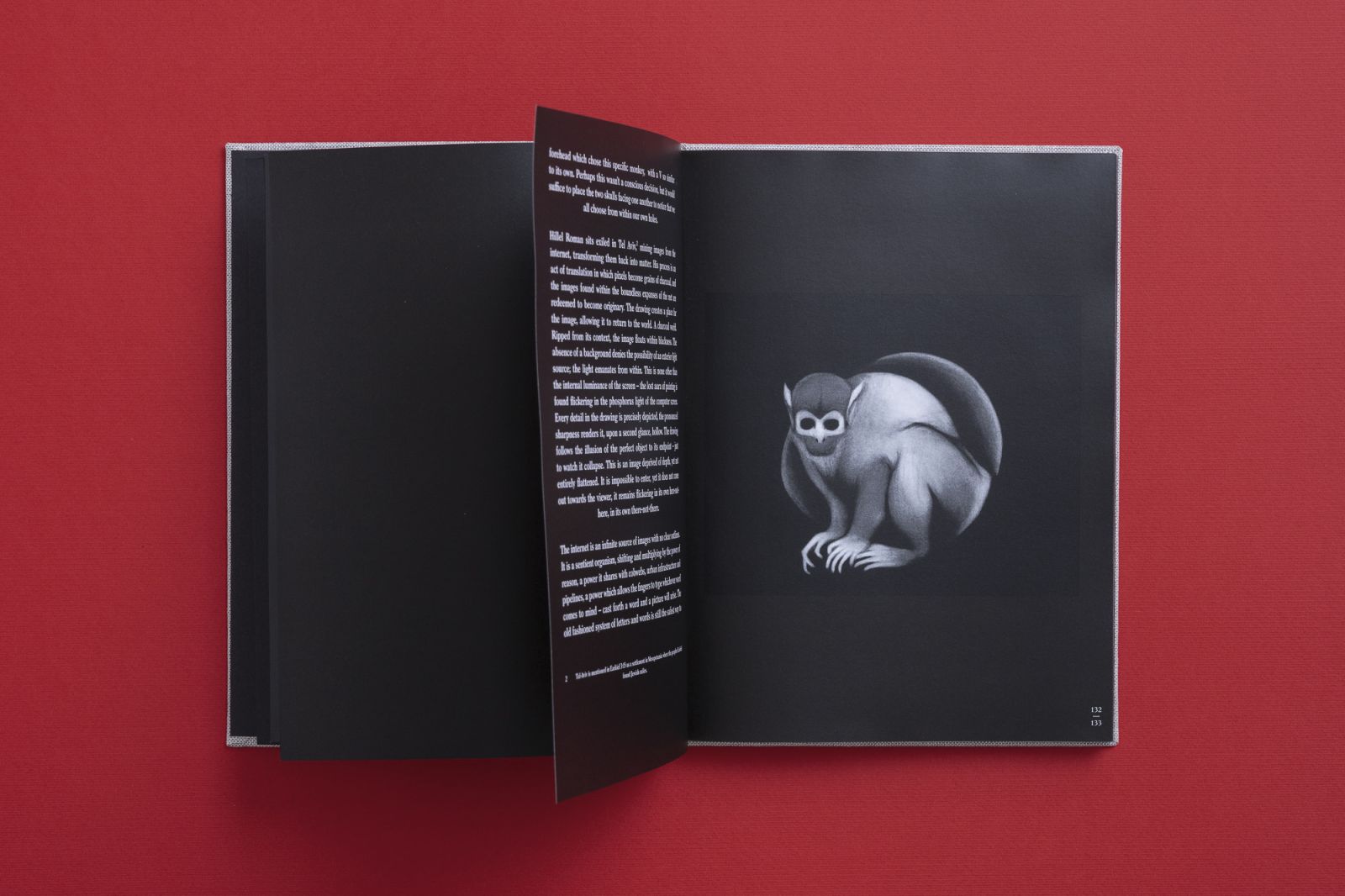
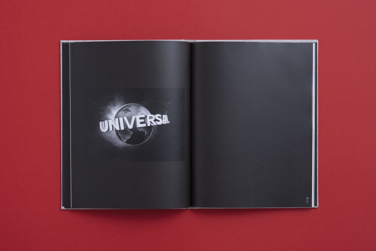
Merhav claims that Universal is a kind of visual dictionary. It refers to the letter V on the ship’s sail and on the monkey’s forehead. He also claims that the monkey is a kind of self-portrait, and that the book is a kind of Noah’s ark, while the graphs you make signify erosion and decay.
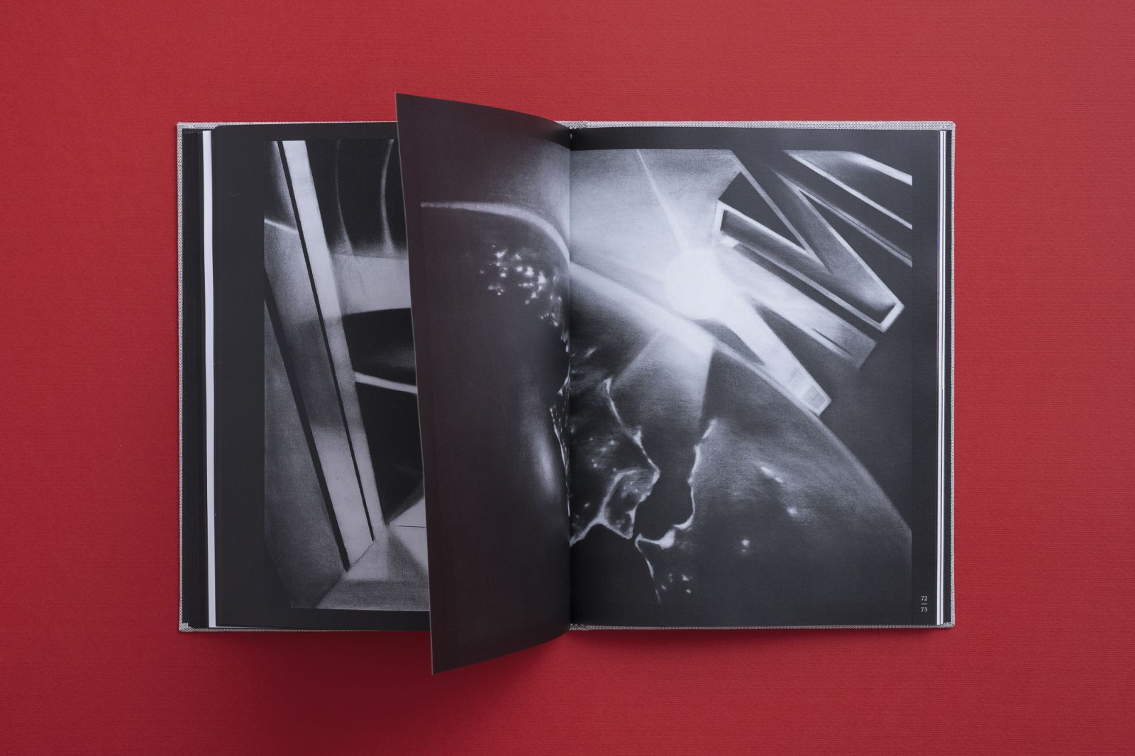
I have been interested in the exponential graph, which became very popular during the corona virus, and mathematical graphs in general, for a long time. Graphs represent an abstract mathematical principle, which can also be present in reality itself. That is, sometimes they are seen visually through the phenomenon, as in the drawing of the waterfall or fountain in the book. Water moves in parabolic paths. It’s basic physics. But you can also look at it like a page from a math book, even though it’s an oil painting on wood. The principles at work in nature interest me, as well as my obedience to them. It’s also related to the question of “what came first?” The law of painting, the text of the book, the drawing of the waterfall, and so on. From the moment we asked about the connection between mathematical abstraction and its representation, just like the fact that without knowing it I had followed the hidden law of the sharp points, the search becomes more and more complex. Merhav’s text tries to touch on this mystery, which corresponds between the structure of our consciousness and nature.
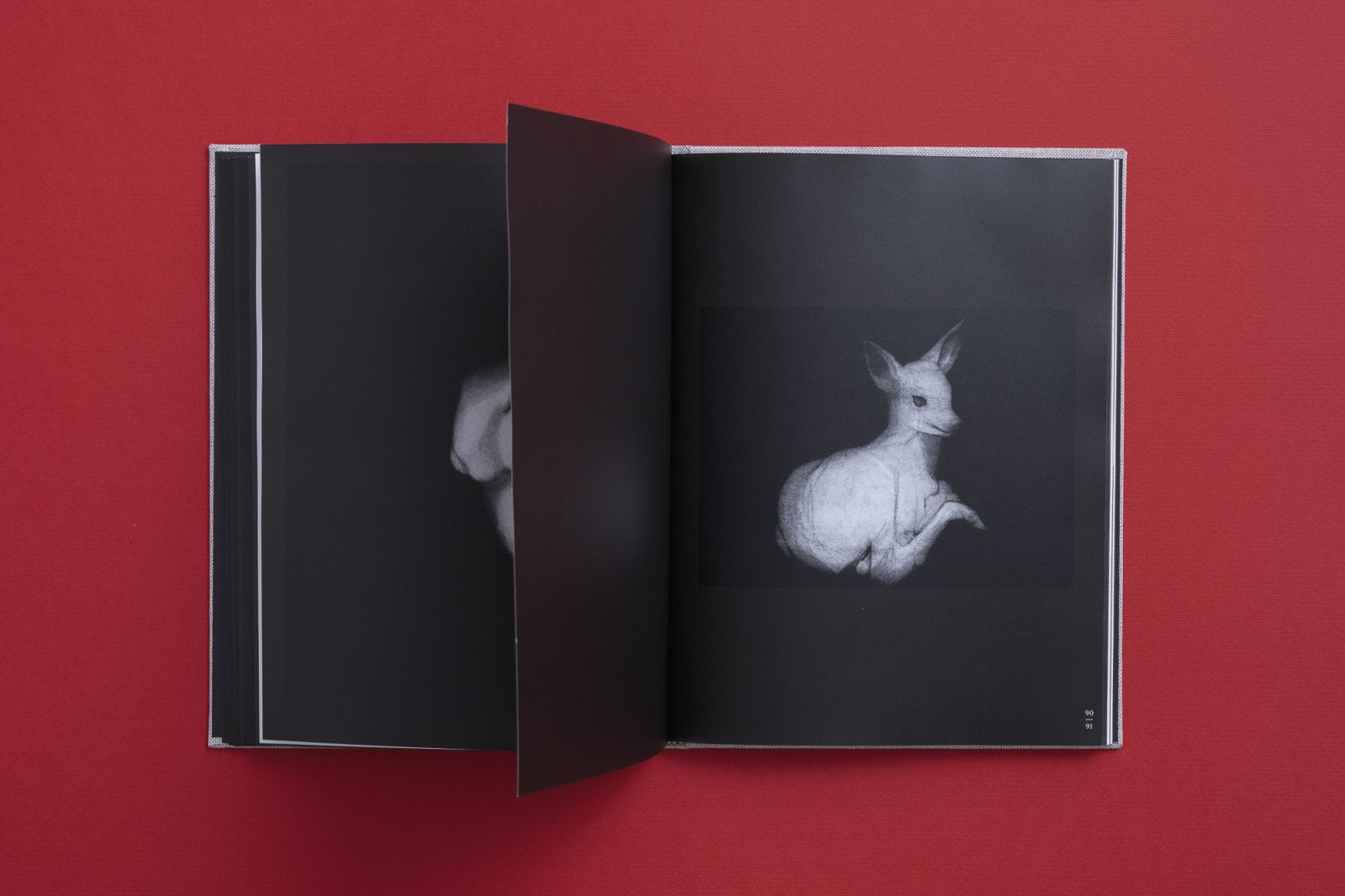
I like the idea of “fragments” that Merhav raises. We live our lives and become a kind of conglomerate of things we have collected, ideas that have passed through us, for which we become a kind of receptacle or capsule. This concept echoes in the images in a split kind of way: There are images that try to communicate ideas from the inside out, like transmitters; and there are images that are a platform, or a receptacle for ideas that come from the outside. A kind of ying-yang duality, like a female-male.
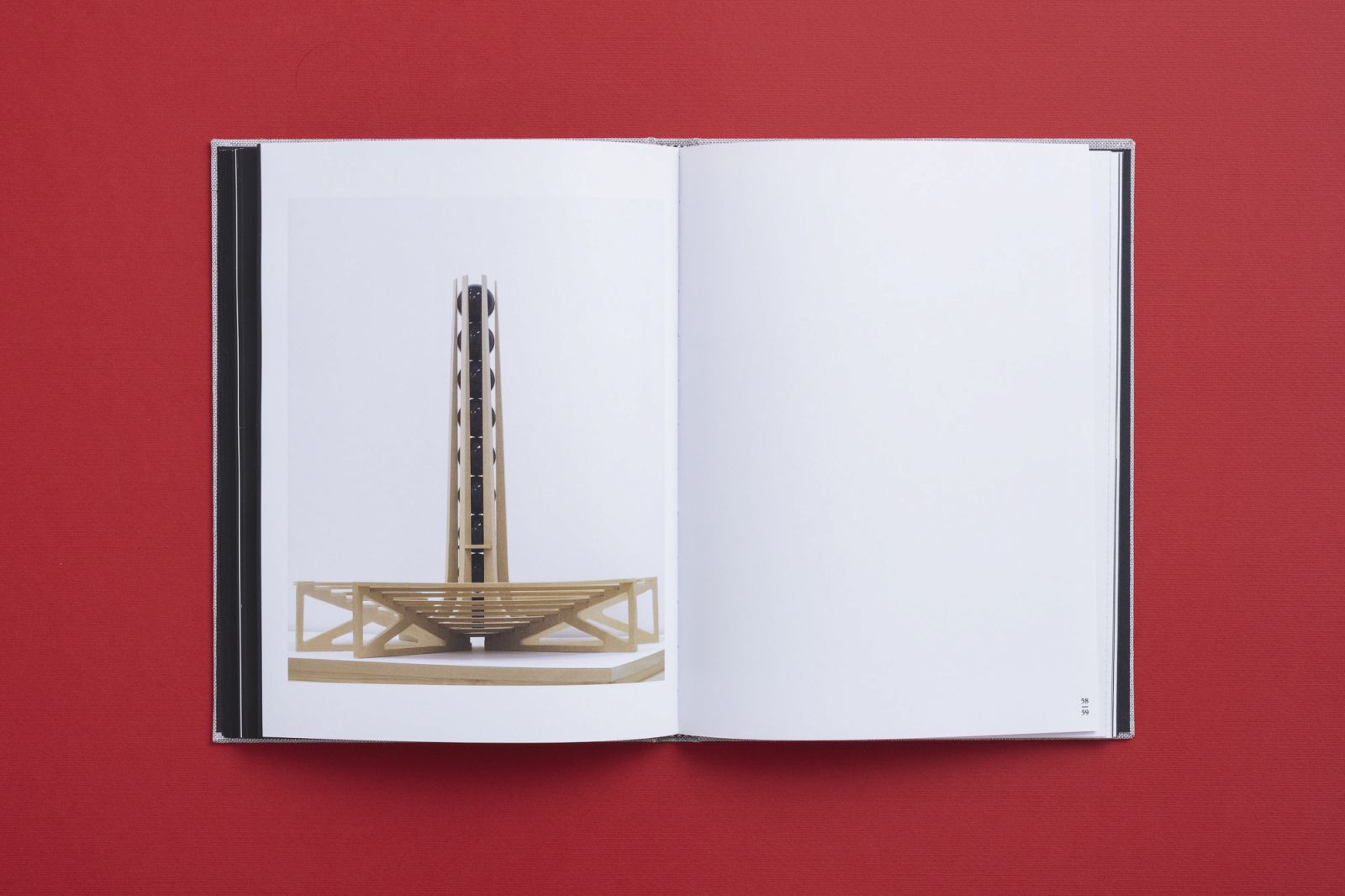
I never thought of it as feminine and masculine. That’s interesting. I guess it places the whole issue of the sharp points in the paintings as a male element. The concept of receptacles also preoccupies me. The public projects I create deal with this concept. For example, the project in Yaffo 23 that appears in the book (from the exhibition Art/Life, Curator: Roy Brand, 2012); Tall House, on Rothschild Boulevard; or the stay I did at the Tel Aviv Museum of Art this year (2022). They all deal with the way art is not necessarily a predetermined unit of meaning but a vessel waiting for other things to fill it.
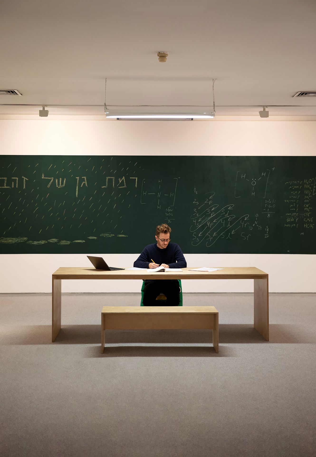
The project “Mandatory Course in Life Sciences” was created following a call for staying actions and being physically present in the museum (the Tel Aviv Museum). I offered to study an introductory chemistry course at the Open University while sitting in an empty space. I sat in the museum for a month and studied. When I wasn’t there, the space with the table and the chalkboard remained, waiting for something to happen. And something did happen, precisely at the end of the stay. When I was no longer there, someone came in without coordinating with either me or the museum, and read Buddhist scriptures there for a week. It was amazing. The space which remained available until the next exhibition was suddenly filled with another, unexpected and uncontrolled presence. In fact, even in Observatory (Herzliya Biennale, Curator: “Piknik,” 2009), there was a large element of entreaties and dependence on something else, an expectation of something external to “art,” which would happen and activate it.
It’s hard not to think of Marina Abramović’s work The Artist is Present. Only in this case, I would say, the artist is not present, or maybe, the artist is busy.
Yes, that’s funny. There was something passive or introspective about the action, which is not immediately interpreted as artistic or even performative. The conversations with the audience were also kind of casual, I’m doing something, but let’s talk a little for now. It allowed for many more things to be said that I’m not sure would have been, if I had just been sitting and waiting for people to come talk to me.
Let’s get back to the book. The title is very compelling, how did you come up with it?
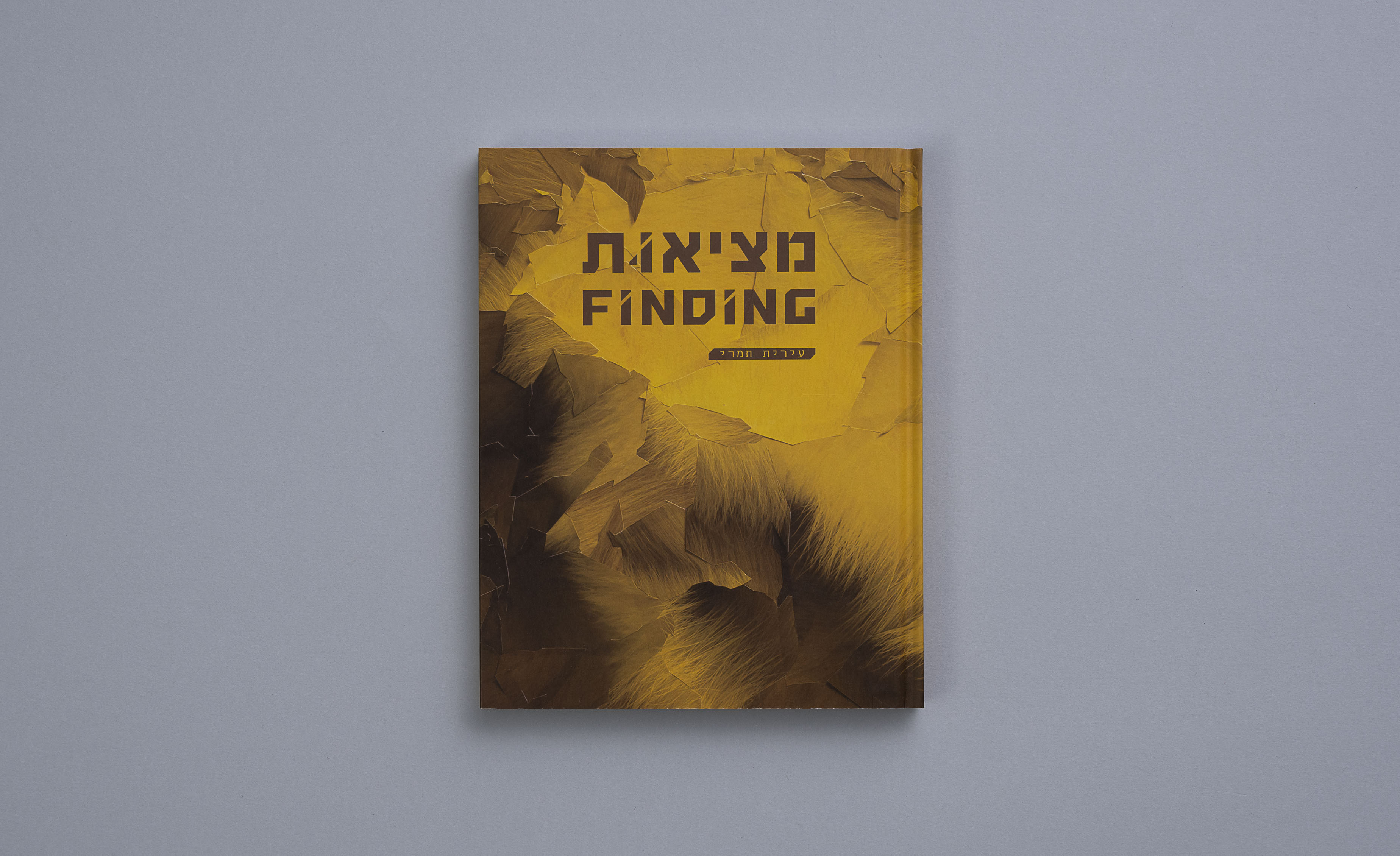
The designer Guy Sagee chose it from a painting series that includes several frames from the Universal Studios opening credit. This is the video that appears at the beginning of every movie produced by the company. The suggestion for the title seemed right to me, because it echoes the human search for a unifying factor. We are constantly looking for that one thing that tells us that the world is not a collection of unrelated chaos. In theological terms we call it One God, in science we look for a unifying principle of all phenomena, and go crazy from the inability to unify the different theories.
The clip for Universal Studios presents this fantasy of unity. The name wraps around the earth, then the name Universal appears. It’s a moment we’ve seen hundreds of times, the moment “before” the “real” movie begins. There is grandiose music, the sun is shining, and the planet earth appears along with the word “Universal.” I read it as a dramatic moment when the world splits from the word, and vice versa— the word calls for union at the same time it splits from the world. It’s a reflective moment about the instant, the great split in which we live. A fitting name for the book.
You’re a multidisciplinary artist, you draw, print, build geometric things, you create site-specific and performance works. It surprising to hear you say that you are looking for unity within the divisions.
Yes. Maybe I’m only now beginning to understand how the things I do still connect to the whole, the coherent mass, more or less. There is something calming about it. On the other hand, I have a constant aversion to one thing, to logic and order, which may be what’s pushing for this activity in all kinds of fields and materials. It’s an inherent dialectic of bifurcation. What does the tree house have to do with studying chemistry, and a radio station? The connection becomes clear from the facts. It’s an outlook that’s sometimes difficult to fill.
When they ask me “What are you? What do you do? What do you teach?” I answer that I teach painting, and then I go do a course Arduino in the community center; I sit and build computer-controlled wind chimes with parts that came from China; I preach to students to make art that goes beyond the boundaries of representation, and then go and paint a figurative painting in the studio. I feel weird about it. But this movement is probably the thing that is important to me, and it is also part of what this historical moment allows us, maybe is even forcing on us. The accessibility to so many types of information and skills, materials and social interactions. It is a state that produces a consciousness that is simultaneously fragmented and hyper-connected.
You are basically saying that even when the surface appears split, it is not necessarily destructive. Everything is ultimately part of one galaxy. This leads me to thinking about the book as a galaxy, and to talk for a moment about it as a sequence or constellation. The book is arranged from right to left, like a book written in Hebrew, even though the title is in English.
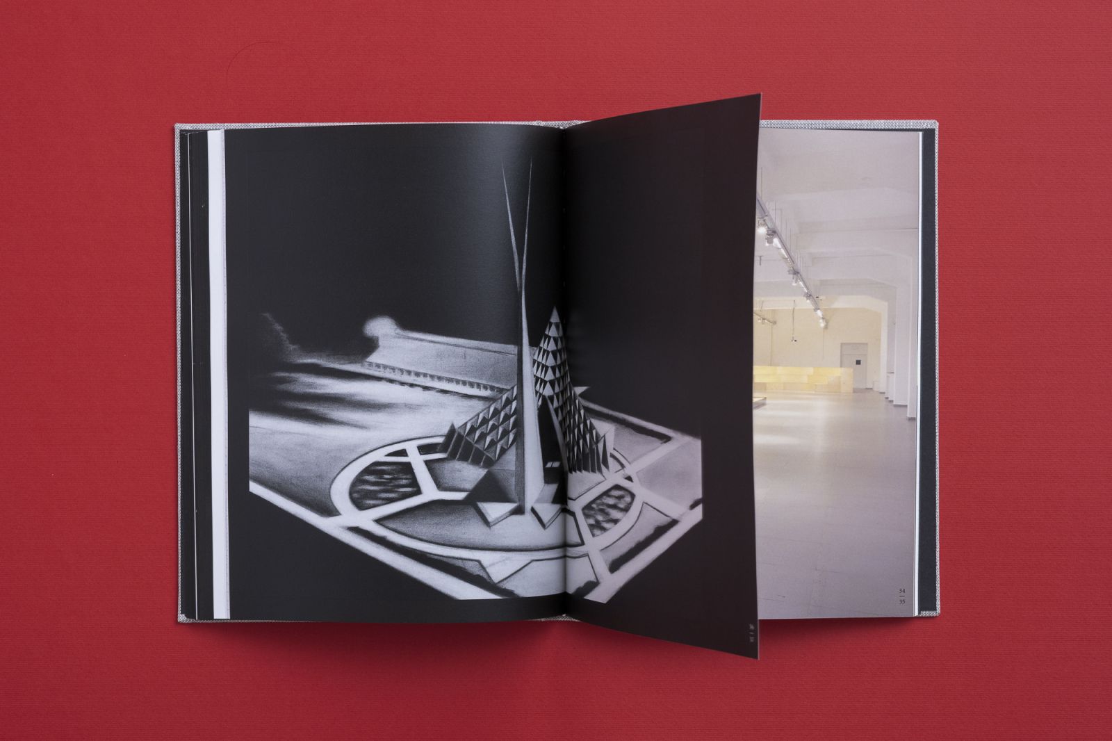
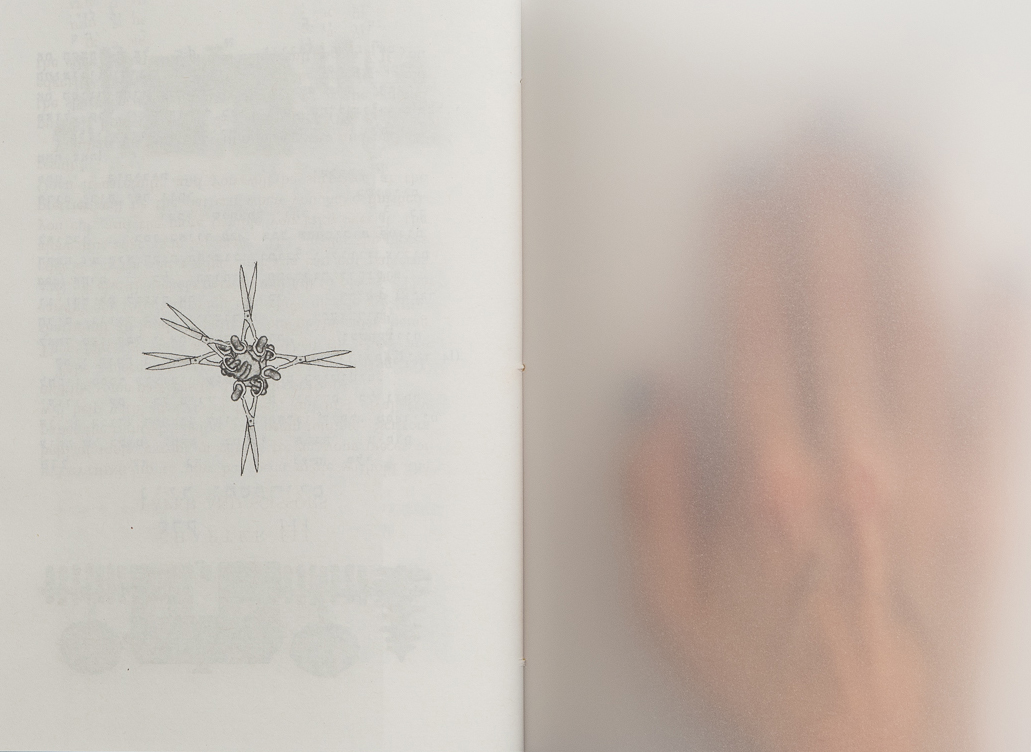
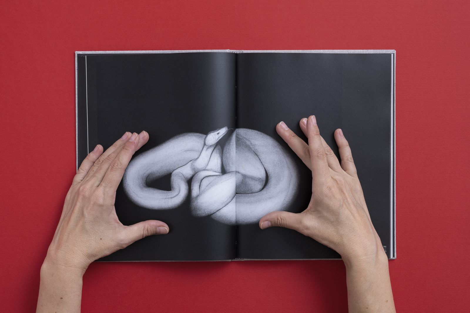
Another split. I live and work in Israel, and the book is financed by the National Lottery. It was clear to me that it would appeal first to the Israeli audience. At the same time, the book was published by Sternthal Books, which operates in Israel and abroad. So from the beginning we wanted the book to be bilingual and two-sided. The logic that guided the structure of the book is that of movement in space. There is only one text in it, so the main experience of reading the book is visual, of moving from image to image, movement in the spaces of my consciousness – a mix between different series of drawings, installations and also sketches that were not shown before, that the designer, in his wisdom, suggested to print on thin matte paper. As well as some colorful paintings I did at the beginning of my career. They create a colorful and warm core to the book, which could have been very monochrome and cold.
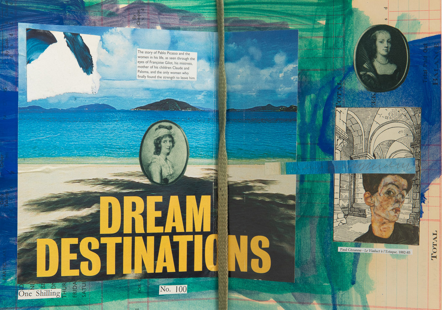
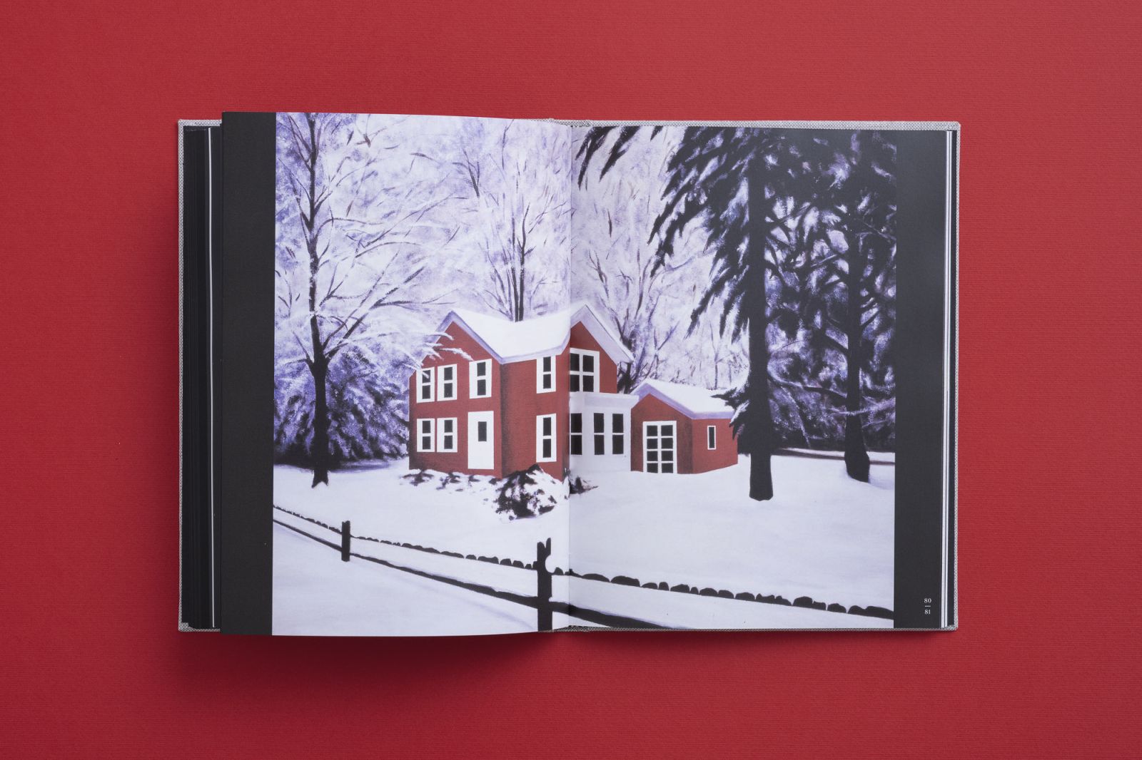
And really, with all the book’s charcoal and monochrome palette, there is a very colorful double-page spread that seems to belong to another series. The spread of the house in the snow. What is that?
The image was originally taken from image bank. It reminded me of a Nordic fantasy about a villa in the jungle, a Christmas card, and also Stephen King’s book Misery. A kind of fortification in the image of a house. The silence of snow can absorb a lot of violence, and also serve as a fantasy about a vacation somewhere else. The painting is part of a series of oil paintings. At the time I did them, there was no Google Images, there were commercial sites like Alta Vista, which were organized by words and structured categories, unlike how things work today. Looking back, it was a moment that heralded the flood of images and video we now find ourselves in. I grew up in a world that saw far fewer images per minute. I remember riding the bus and seeing only one advertisement the whole way. Today, the social networks are killing the fantastic element of the image, the remnants of its power. In the ‘80s there was still the desire for the object that the image held for us. Today, we are a lot less naive about what we are shown, so it is harder to indulge in fantasy or imagine the future. The ability to imagine a future is critical to the political imagination, which is necessary to create change.
Apropos future and passion, are you thinking of doing another book?
I have two books I know I want to do: one of all my drawings, because there are many more that didn’t make it into the book, and also because I’m interested in seeing them in chronological order. The other book I would be happy to do is of my public works. I see it in the format of a binder that can be added to each time. Each project will be a modest booklet. The book will be distributed at the display site of any public installation, and can also continue to be added to. A book that continues to be made.
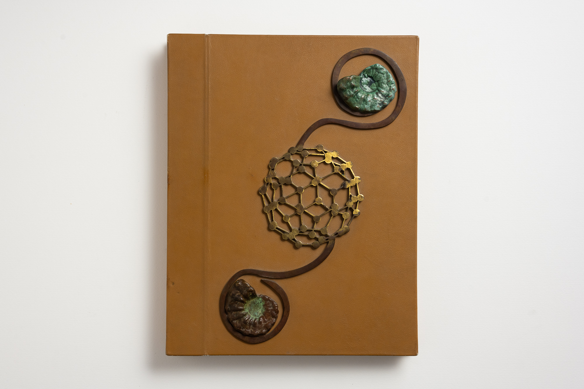
The fabric cover is amazing. Is it a print of an image?
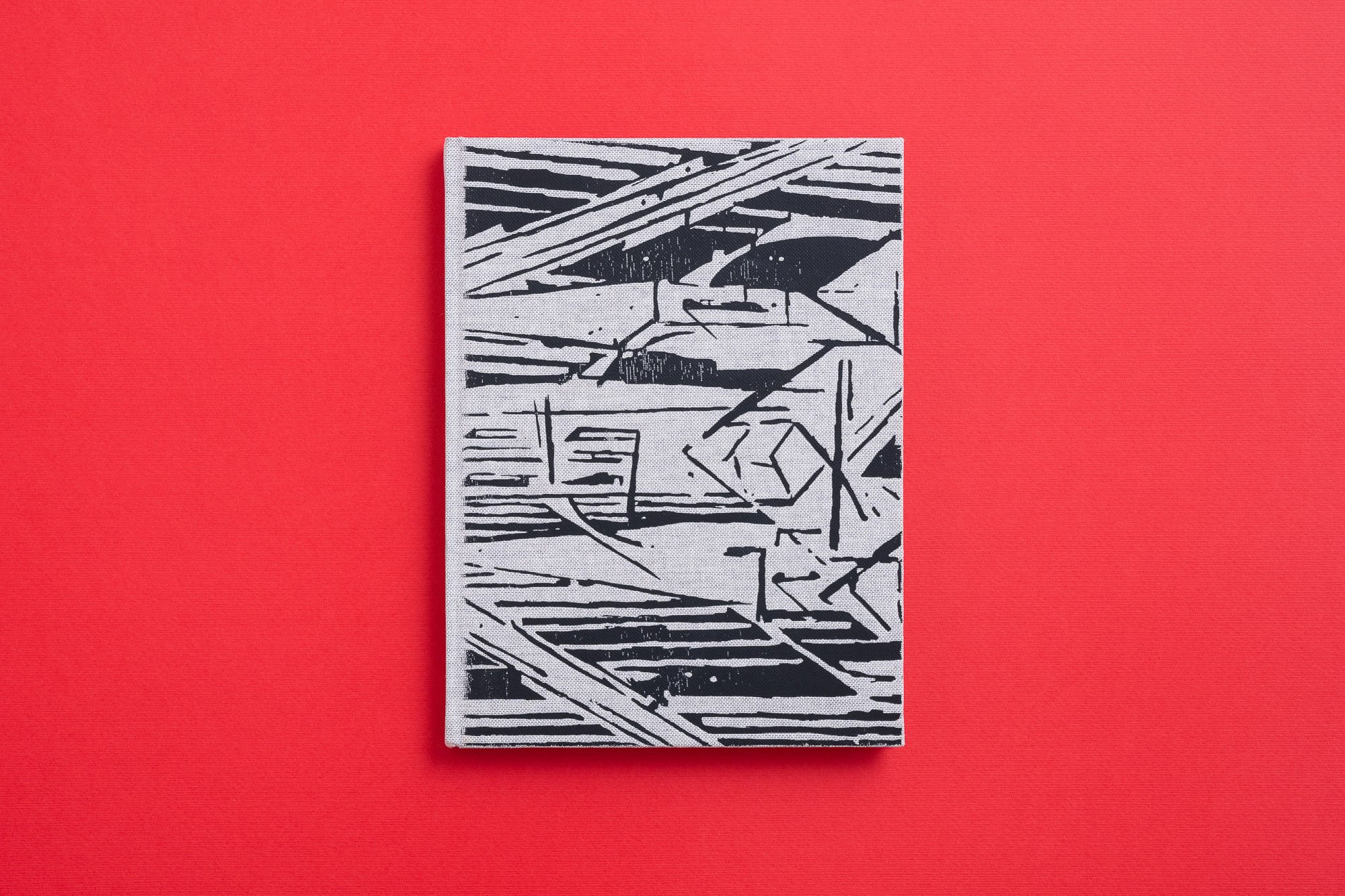
The image on the cover is “sampled” from Lyonel Feininger’s Bauhaus Manifesto, which I cut, rotated and duplicated. I see a definite connection between the Bauhaus movement and Universal. Their architectural style is called the “International Style,” which is like, that's it! We have arrived at a format that the whole world should follow. IKEA’s design is also a product of this history. On the other hand, the early Bauhaus, when this manifesto was written, did not aspire to this kind of totality. It did call for unification, but not dogmatically. It aspired to a creative-social union of all the arts together; for the rebuilding of the cathedral, of a spiritual building. It was, and still is, in my eyes, a revolutionary and optimistic call to our creative forces.
And as for the cover. Long before thoughts of the Bauhaus, I made a note to myself of the gray linen fabric that was on the cover of a Schwontkowski catalog. This is how we arrived at this deep foil embossing, which is created by block printing and heating. What is special in hindsight is the size of the embossing. Usually, a word or a small icon is embossed. The normal embossing machine at the printing house I worked with couldn’t do what I wanted, and it was a real crisis. It’s funny to think about it today, but I was on the verge of a breakdown.
Then, in some psycho-magical occurrence, the only place with an embossing machine that was strong enough ended up being an ultra-Orthodox factory that produces religious books in Jerusalem. They have very advanced binderies. Sagee and I went there. It was a miracle because I thought it would never happen. Then it also turned out that they printed it in the wrong size, and had to throw all the covers out and start over again. I learned it ain’t over ‘til it’s over. To let go more – to prioritize mental health over the perfect result. I really like how the book turned out, it makes me happy every time I see it.
Did you dedicate it to someone?
Yes, to my partner and my daughter.
Where can readers get a copy of the book?
At Parterre Projects, at Jaffa III Books, Hamigdalor and Sipur Pashut in Tel Aviv and on Sternthal’s website.
"The principles at work in nature interest me, as well as my obedience to them. It’s also related to the question of “What came first?” The law of painting, the text of the book, the drawing of the waterfall, and so on. From the moment we asked about the connection between mathematical abstraction and its representation, just like the fact that without knowing it I had followed the hidden law of the sharp points, the search becomes more and more complex."
"We are constantly looking for that one thing that tells us that the world is not a collection of unrelated chaos. In theological terms we call it One God, in science, we look for a unifying principle of all phenomena, and go crazy from the inability to unify the different theories."
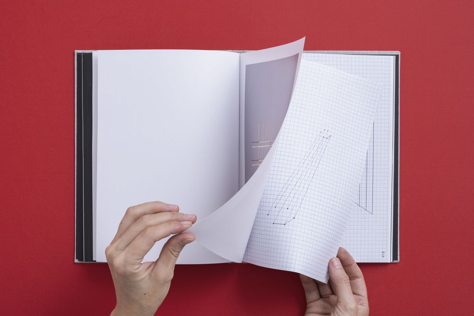
"There is a mix between different series of drawings, installations, and also sketches that were not shown before, that the designer, in his wisdom, suggested to print on thin matte paper. As well as some colorful paintings I did at the beginning of my career. They create a colorful and warm core to the book, which could have been very monochrome and cold."